
The Psychology of Website Color Choices and How They Directly Affect Conversion Rates
The Psychology of Website Color Choices and How They Directly Affect Conversion Rates
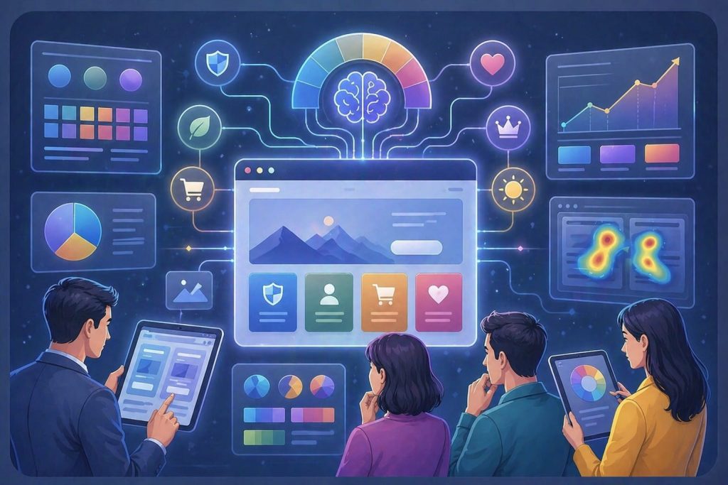
When people land on your website they don’t just read what they feel. In seconds your website’s color can influence how they see your brand, build trust and motivate action. Color choices are not about looks, they are deeply psychological. When used correctly your website colors become tools for increasing conversions.
Why Color Matters More Than You Think
Studies show that 62%–90% of a user’s impression of your website is based on color alone. This happens in less than 90 seconds. This means your website’s text, features or pricing may never be noticed. Your website’s colors. Convert your visitors or not at the very first impression.
More interesting:
A single change of a call-to-action button can bring about 10-30% higher conversion rates. Website colors do contribute to revenues.
How Colors Trigger Human Behavior
Your website colors work because they appeal to our nature in the following ways:
Urgency
Warm color choices like reds and oranges increase heart rates. This establishes a sense of urgency. It promotes behavior and quick decision-making within your website. That’s why call-to-action buttons like “Buy or “Limited Offer” buttons are often red.
Trust and Security
Cool colors promote trust, stability and calmness. Banks, SaaS platforms and healthcare industries use them frequently. They instill confidence. Encourage user confidence when it comes to sensitive transactions.
Visual Hierarchy and Focus
Humans notice contrast. This is how buttons get noticed. A button that stands out will always attract clicks than one that blends in. Contrast plays a role in conversions.
Emotional Alignment
Mismatching color schemes to your brand identity will make users feel uneasy. Using neon yellow in a law firm or bright red for a luxury brand may give a user a feeling of unease. This might silently kill your website conversions.
What Different Colors Actually Mean
Let’s look at the connotations of different colors and their impact on website conversions:
Red. Urgency and Action
- Best for: Flash sales, limited time offers.
- Red sparks urgency. Drives quick action on your site.
- Red CTA buttons can boost conversions by up to 21%.
Blue. Trust and Reliability
- Best for: Finance, SaaS healthcare sectors.
- Blue fosters trust, security and reduces risk perception.
- Blue is the color used most by trusted brands globally.
Green. Safety and Progress
- Best for: Checkout “proceed” buttons.
- Green signals safety. Go”.
- It works well for wellness and eco brands.
Orange. Energy and Engagement
- Best for: Signups, trial periods.
- Orange increases user engagement.
- Orange CTA buttons have improved conversions by 32.5%.
Industry-Specific Color Strategies
Different industries use triggers differently. This leads to color palettes:
Finance and SaaS
- Dominant color: White.
- Why: Professionalism, trust, clarity.
- Fintech applications often use blue to alleviate concerns.
E-commerce
- Dominant colors: Orange
- Why: Urgency impulse buying.
- Orange is used in flash sale announcements and call-to-action buttons.
Health and Wellness
- Dominant color: Green.
- Why: Calmness, growth, safety, life.
- Green creates a soothing environment.
Luxury Brands
- Dominant colors: Black, gold
- Why: Exclusivity, premium quality, sophistication.
- A pure focus on color can increase perceived value by 10-15%.
A/B Testing: What the Data Really Says
Real data backs up these claims. A button color change can drive a 10-30% increase in conversion rates.Color only works if your copy is persuasive design is clean and value proposition is clear.
Real Brand Transformations Using Color
CTA Contrast Fix
A SaaS company changed their call-to-action button from blue to orange.
Result: improvement in visibility and a double-digit percentage increase in clicks.
E-commerce Urgency Boost
An e-commerce site switched their call-to-action button from green to red for a summer sale.
Result: sales, purchases and rapid decisions at checkout.
Trust-Based Redesign
A financial website simplified its color palette to blue and white.
Result: More form submissions and a significant increase in user trust.
Mistakes That Kill Conversions
Well-intentioned designs can suffer if colors aren’t used wisely:
- Using many colors that confuse the user.
- Low contrast that makes call-to-action buttons invisible.
- An inconsistent palette that weakens your brand.
- Neglecting users in design and color choices.
- Following trends that might not resonate with your audience.
How to Use Color Strategically
- Prioritize contrast. Ensure your Call-To-Action button pops.
- Align color with intent. Use orange for decisions and blue or green for trust.
- Simplify design. Stick to one color and one accent color.
- Always A/B test. What works for one audience may not work for another.
- Remember design. Colors appear differently on screens.
Why Businesses Choose Techco Agency for Conversion-Focused Design
At Techco Agency we engineer websites for conversion. Our approach involves psychology-based color systems, data-driven A/B testing and industry- design solutions.